FINDING YOUR HOME COLOUR SCHEME


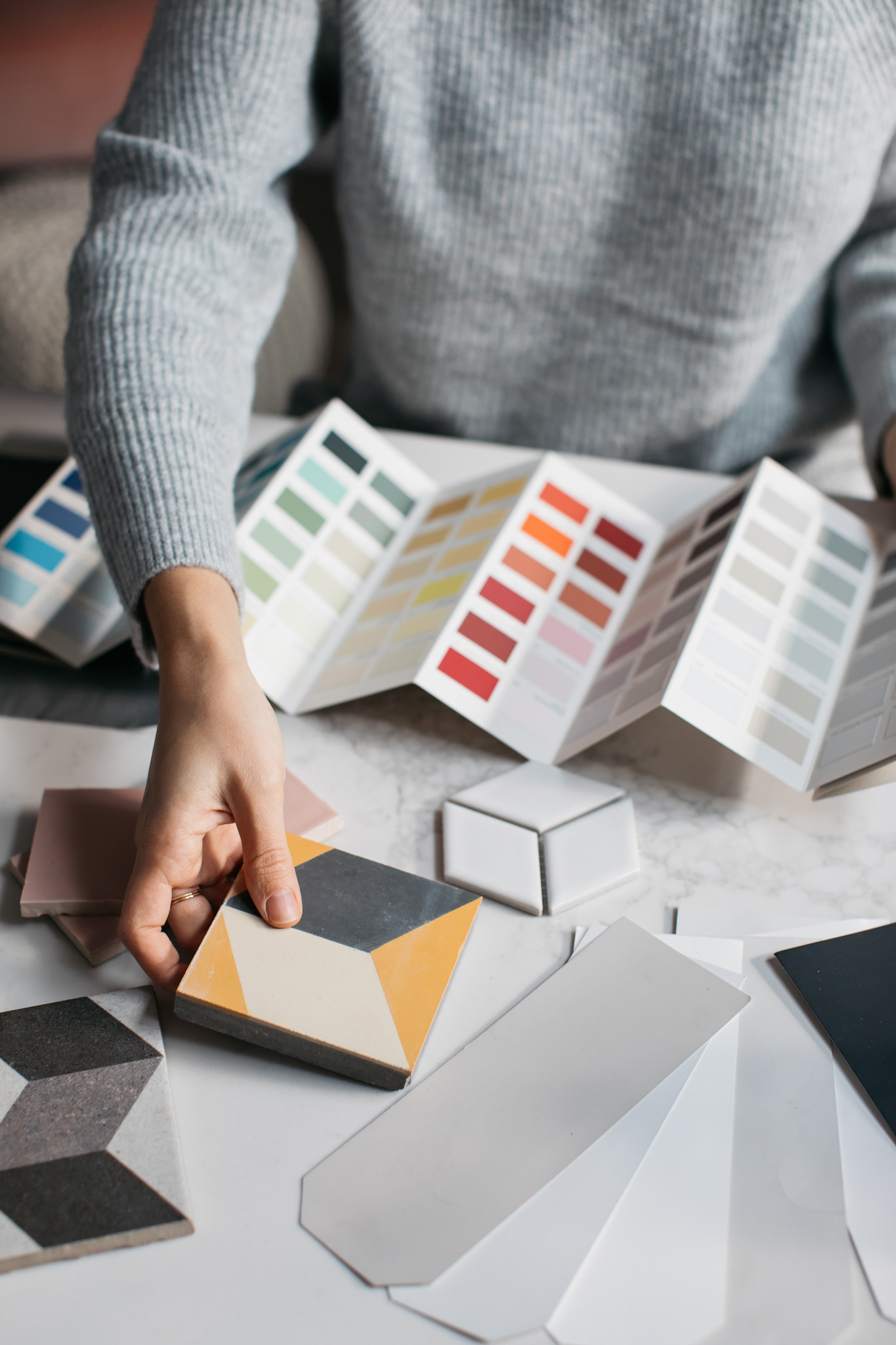
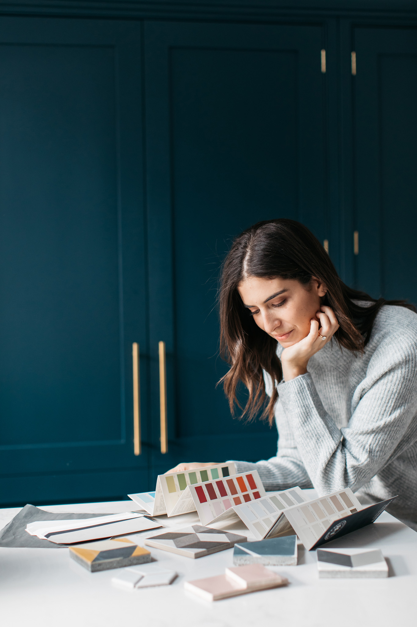
One of the questions that just kept coming up when chatting about our home renovation with you guys, was ‘how did you pick the colour scheme for your home?’ I guess maybe it’s because we didn’t go all white and grey like our previous home was. Paint and tile colours were without a doubt one of the hardest decisions to make, probably because they’re one of the most important. What’s the point in doing all the renovation work if the finishing touches aren’t right? We didn’t want to end up with a home that felt like it could have been anyone’s, we wanted to bring as much of our personality into it as possible. However, until this question kept coming up, I hadn’t even realised I had a “scheme” as such, I was just picking colours I loved and luckily they all seemed to work well together.
It all started with Farrow & Ball’s Hague Blue, that was the first colour I knew I definitely wanted. It’s been very on trend for a couple of years, but even since people have moved away from it and more into the deep greens, it’s a colour I still absolutely love. Compared to the usual navy blue, Hague Blue has this deep green undertone that makes it so special and makes other colours, particularly warm colours like brass, orange and yellow, stand out so beautifully next to it. It took me a while to figure out how much to use it, just in the lounge? Across the entire back wall of the downstairs room? In the kitchen? But in the end I settled on the lounge walls and woodwork and the kitchen cabinets.
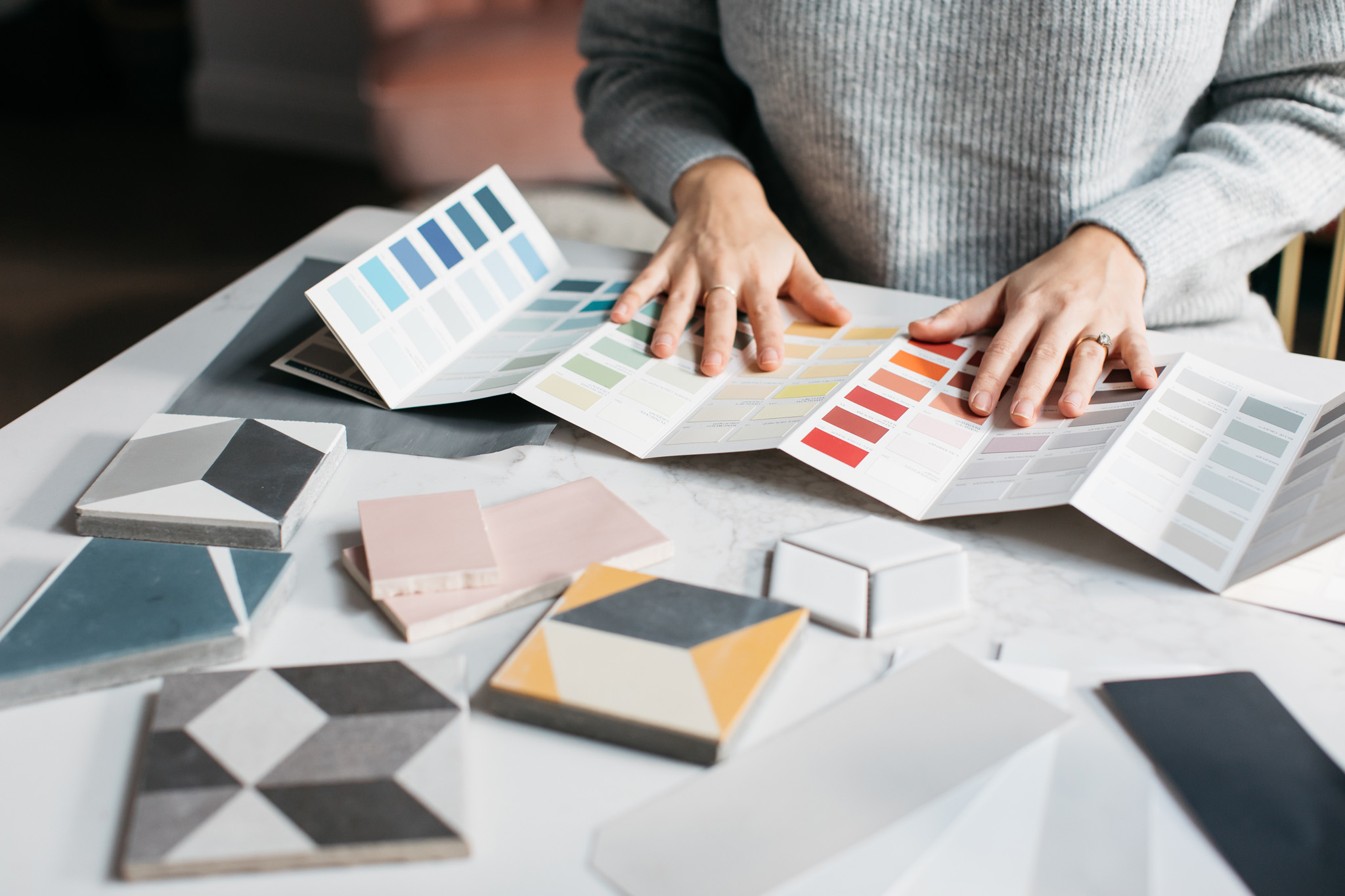
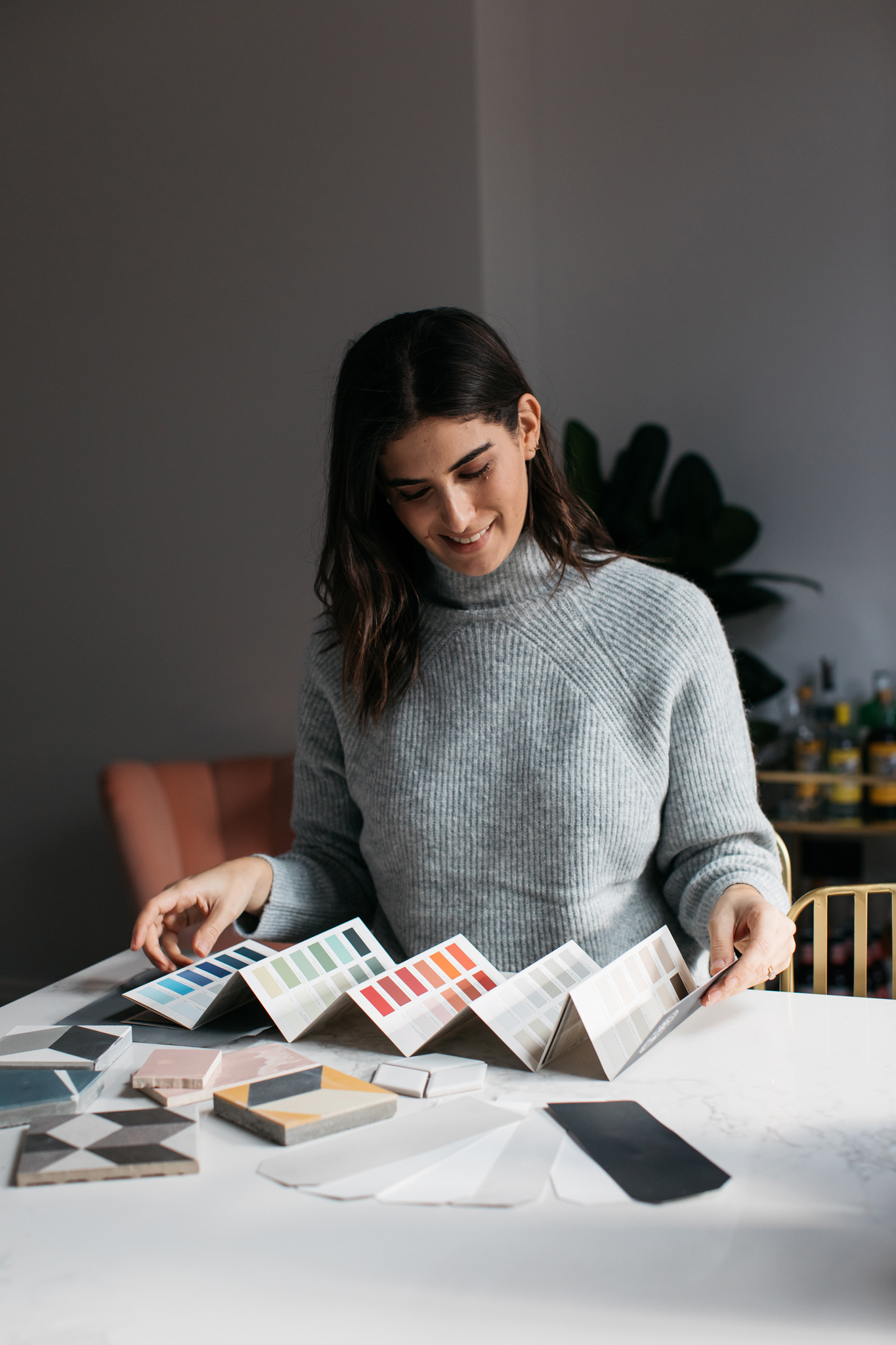
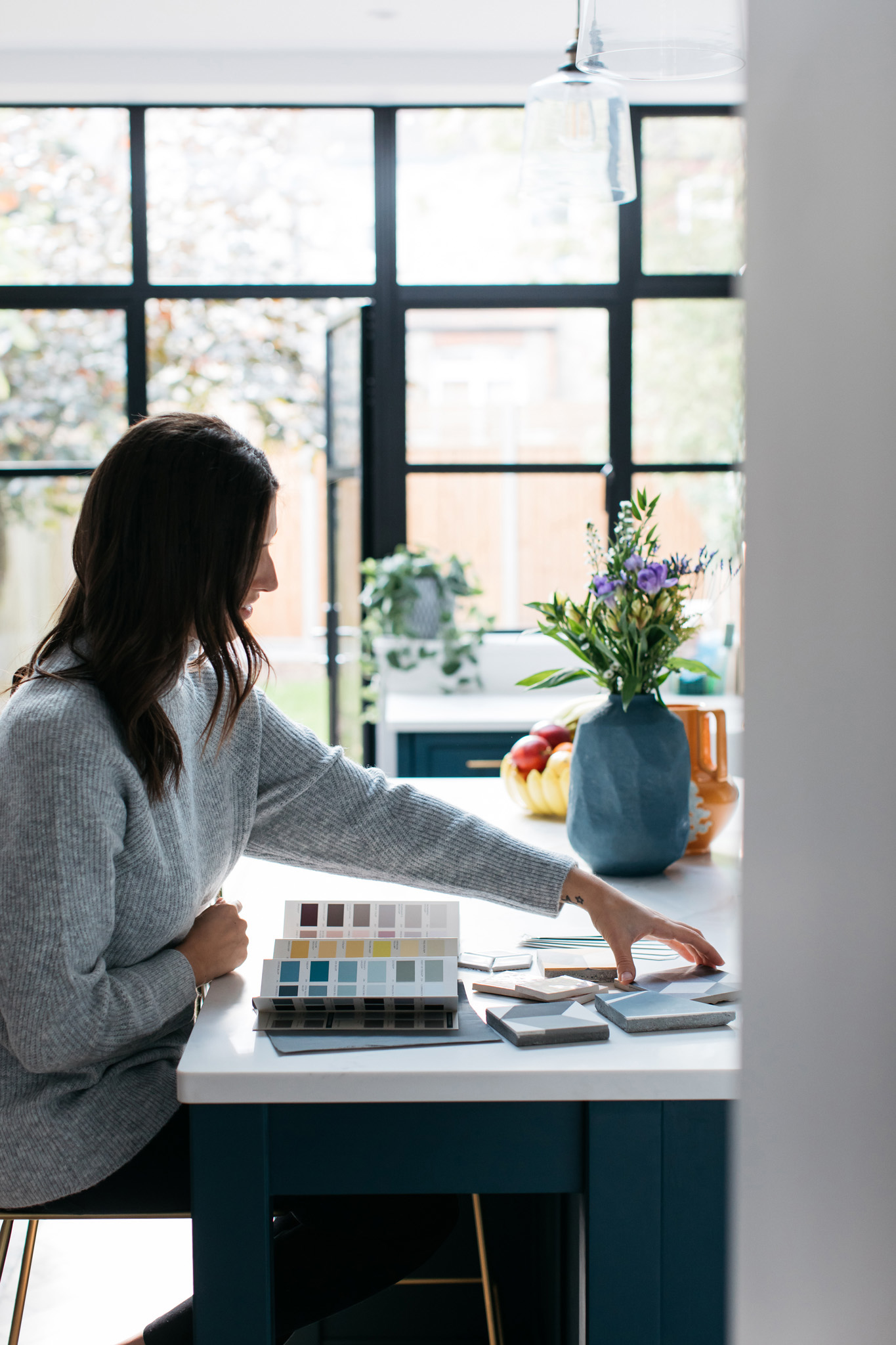
Deciding on a white to use throughout the house was tricky, THERE ARE SO MANY WHITES! I had the help of a family member who’s an interior designer so she really helped me to compare colours and find one that works for us. I didn’t want anything that swings too warm toned but I also didn’t want pure white as it’s too clinical and not “homey” enough. We tried greys but the darker parts of the house like the hallway made the greys look so muddy. We chose Farrow & Ball’s Wevet in the end, which is a delicate, almost translucent white and I’m so happy with it. It’s fresh and bright but soft at the same time. We used this on all the ceilings as well and it sits perfectly next to our other paint colour choices.
When it comes to brands we didn’t just use Farrow & Ball, but for the majority we did, mainly for ease of ordering but also because their colours are what stood out to me the most. For our hallway we wanted something quite dramatic but also welcoming and I’d seen a photo on Pinterest of a black bannister and yellow front door. I knew it would look great with the black radiator we were getting so we just went for it, using Farrow & Ball Off Black on the bannister and Little Greene Mister David on the inside of the front door. The yellow was harder to find, I didn’t want mustard and I didn’t want pastel – this turned out to be the perfect yellow (after lots of testing!).
I guess with paint, it comes to a point where you just have to be decisive and realise that it’s not the end of the world and that you can always re-paint one day. Everyone says not to paint samples directly onto the wall as seeing them next to each other can be confusing, and they’re right. Buy an A2 pad of paper, paint an entire page, cut off the white borders and blue tack them around the house to see the colours in different lights. Each time you decide on a paint, leave it alone and don’t keep going back to it, there’s a reason you were drawn to it so trust your instincts.
Text paragraph goes here
We didn’t want every single room to have a wow factor, we also wanted to be practical with our decisions, so for our easy grey paint choice we chose Farrow & Ball Ammonite which we used in my office and in the small spare room. It’s a very relaxing colour so I thought it would work well in those spaces, but it also looks very different in different lights. At the front of the house it seems more of a cool toned grey whereas at the back it’s a warmer, creamier tone. My tip with Ammonite and with all paints actually is to paint the skirting in the same colour as the walls for a really modern look. We also painted the backs of the doors in the same colour as the room, which I love!
The final colour choice was for the downstairs toilet, which we decided to tile with pink tiles. I saw an image on Instagram and fell in love, although I really did question it for a while, knowing that it will go out of fashion and would probably become the the next ‘avocado bathroom’ that I’ll hate. We almost didn’t do it but I just think if you are going to be daring, be daring with the tiny cloakroom. It wouldn’t cost the earth to replace them, it’s a very small room and why not have fun with the guest toilet that so may people will walk into and enjoy. So we went with the pink tiles and to balance them out, and to give them a modern chic look we painted the walls above and the woodwork in a dark grey, again another quite difficult one to find. We chose Paint & Paper Library’s Paris Rooftops which was the perfect medium/dark grey, it goes so well with the pink.
So whether you’re about to embark on a full renovation or just want to re-do your bedroom, remember to go with your gut instincts, be brave and have fun!
Photos by Emma Croman